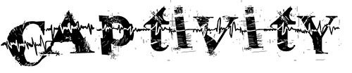
We liked this font because of the heart pulse through the middle of the writing. We are considering this font for our main title.
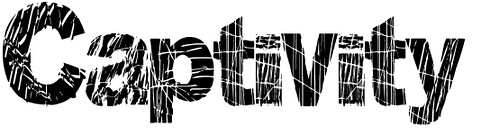
We liked this one too as it is distorted and looks scratched and worn.
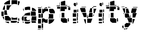
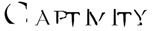
We're not too keen on this font, it seems quite mysterious to the audience.
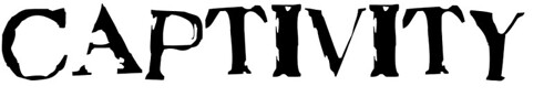
We all really liked this font as it fits the distorted mise en scene we were looking to create.
We liked this font but it seems more suitable for a horror and also it is quite difficult to read.
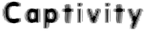
This is a clearer font to read than the above but with a very similar style to it, but we don't like these as much as we do some of our other options.
No comments:
Post a Comment